Home Rennovation Website Build
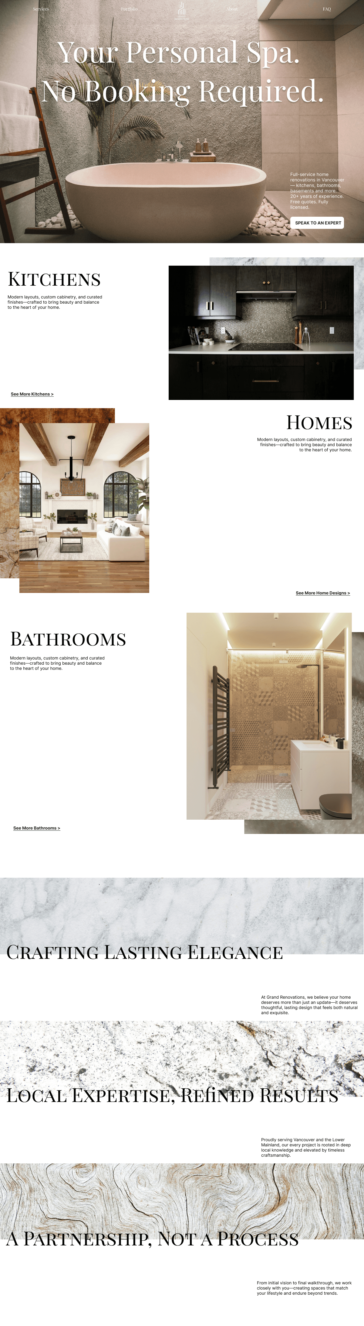
This concept was designed for a local renovation company to modernize their online presence and improve their sales funnel—helping them attract and convert more high-intent visitors while reflecting the elevated craftsmanship of their work. Design Goals: - Reflect the sophistication of the brand’s renovations in a clean, elegant digital format - Support trust-building and clarity through strong typographic hierarchy and visual pacing - Use visual storytelling to tie the digital experience back to the physical, tactile nature of the spaces they build Creative Direction: To maintain a sense of elegance and editorial sophistication, I paired Playfair Display for headings with Inter for body copy. This mix of classic and modern fonts mirrors the renovation work itself—where timeless aesthetics meet contemporary functionality. I also integrated natural textures—stone, wood, water, metal, and marble—into product image backgrounds and section transitions. These weren’t just decorative: each texture aligns with the materials commonly used in renovation work, grounding the visual language in the real-world experience of the spaces. The color palette supports this direction: warm neutrals, soft clay, deep gold, and matte black give the interface a grounded, premium feel without overwhelming the user. Outcome: The homepage concept guides users clearly—whether they’re exploring past work, reading about services, or reaching out. It feels intentional, polished, and aligned with the expectations of a high-end renovation client.